| House Uc - Black Mottled Residence - Casa Abigarrada Negra - | |
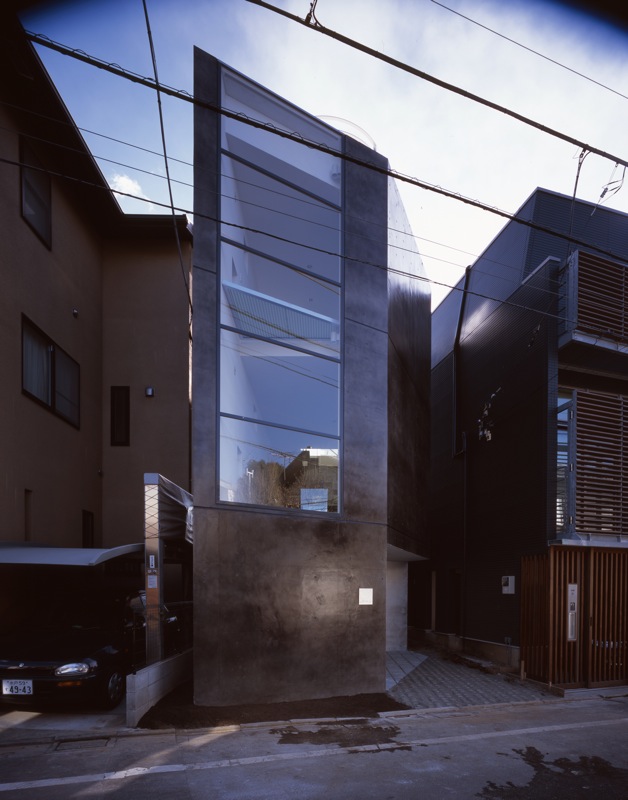
House Uc is a residence designed for a couple in their 30s and their daughter. It is located in the quiet residential area of Tokyo standing on a small and narrow site of irregular shape - a result of the recent trend of dividing property into smaller segments each time it is sold and bought due to inheritance issues and market availability. The site measures approximately 57 m2 in size: approximately 12 meters deep, 6 meters across where it faces the north road, and 2.7 meters across at the deepest end. The design for House Uc therefore needed to focus on the ideal form of an urban detached house within the constraints of the site itself as well as laws and regulations.
The client felt that a residence was a form of self-exposure to the outer world. In order to live up to his expectations, House Uc was designed to imply the essence of the house within the urban context by bringing out the characteristics of the finishing material that was chosen together with the client. The concrete exterior walls were coated with lean-mix acrylic paint, resulting in a black mottled effect according to the difference in the degree of water absorption and smoothness of the surface. The zinc-coated steel sashes on the east side were dipped in phosphate to strengthen the zinc layer, and the difference in the amount of zinc coating on the sashes projected a black patchy effect. The mottled exterior walls and patterned sashes are the result of chance (nature) and display a certain beauty, in a sense similar to human beings – people are attractive, pockmarks and all. The east face was provided as a baseline to anchor the intensely irregular shape of the site. All partitions, equipment, etc. were positioned originating from the north-most corner of the east face. Natural lighting was no exception. Over 20 windows made of raw brass were randomly placed on the east face, allowing natural light to filter in through the golden screens in a nonuniform pattern. This irregular pattern of light provided by the east face or baseline wall will leave an impression on the residents’ minds, helping them with spatial orientation and becoming a trigger for daily actions; the design hopes to enhance spatial comfort for the residents by promoting the automatism of daily actions. For the interior of the house, the first floor consists of an independent bedroom and bathroom. The second floor has a main room with a ceiling that partially opens onto the third floor; this aspect and the stairs made of perforated metal also contribute to the open feel of the main bedroom and tearoom on the third floor. The partitions were made of transparent glass and Japanese paper blinds so as not to divide the atmosphere. The third floor tearoom defined by the sudare or Japanese wooden blinds is the only space that opens out towards the south. Here, the residents can enjoy the view of the century-old landmark, the water tower - a positive reminder of the continuous flow of time. |
|
